


Open your inbox and look at the newsletters sitting next to each other.
Even when the writing is wildly different, the emails often look nearly identical. Same white background. Same column width. Same platform buttons. There’s a logo up top, and then, once you start scrolling, the identity disappears.
If someone subscribes to twenty newsletters, how quickly could they tell which one is yours?
This isn’t a knock on any specific platform: Kit, Klaviyo, Mailchimp, or Substack. Each platform gives writers a reliable container, and that’s a gift. It makes publishing easy. But a container isn’t a home. Branding is what makes it feel inhabited.
A newsletter is already a product, even if it doesn’t feel like one yet.
Writers sometimes think of “branding” as something that belongs to a bigger media company, or to a future version of their business. But readers are already encountering a whole system: the sign-up page, the welcome email, the inbox header, the archive, the paid subscription prompt, the recurring column they look forward to. Every one of those is a chance for the publication to say this is us, or to say nothing at all.
To be clear, good design doesn’t rescue a newsletter nobody wants to read. The writing creates the value. What design does is help a reader recognize that value, navigate it, and remember it. That matters even more once they’re paying for it, because at that point they’re not just paying for information. They’re paying to belong to something specific.
The imperfect line is having a moment.
Emily Sundberg, who writes Feed Me, put it simply on LinkedIn:
“I respect my readers too much to put something ugly in their inboxes.”
That sentence is about more than aesthetics. It’s a signal that the publication wasn’t sent into the world casually, that someone thought about how it feels to open, read, and revisit it. She also said that people trying to find success in media should think more about design. Not to make everything sleek or expensive, but to develop a visual language and understand why it fits.
The best newsletter brands don’t necessarily look the most polished. They look the most specific.
She also said something we think about constantly: in a sea of templatized graphics and AI-generated images, there’s real satisfaction in something obviously handmade. A scribble, a recurring character, a slightly crooked border.
None of these simply decorate an email. They signal a person on the other side of it. It can feel editorial instead of promotional, personal instead of institutional, collected instead of generated.
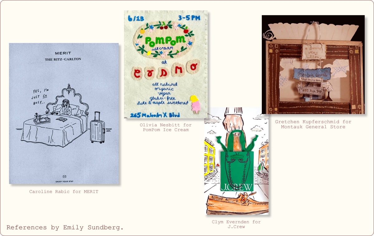
As visual content becomes easier to generate, evidence of effort becomes rarer, and more valuable.
Branded doesn’t have to mean polished.
Here’s the tension worth sitting with: readers love newsletters because they feel direct, like a note from someone smart rather than a polished media property. Too much formal design can work against the very intimacy that makes people open the email.
So the goal was never a rigid template where every issue looks the same.
The goal is a visual vocabulary:
- a wordmark
- a header
- a handful of dividers
- an illustration style
- a small set of colors used loosely
A template tells you exactly where everything goes. A system gives you recognizable ingredients you can recombine, issue after issue.
You want just enough consistency that readers know where they are, and just enough looseness that the thing still feels alive.
What recognition looks like in practice.
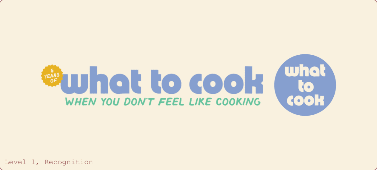
We saw this clearly building the branding for Caroline Chambers’ What to Cook When You Don’t Feel Like Cooking, the #1 publication in Substack’s food and drink category.
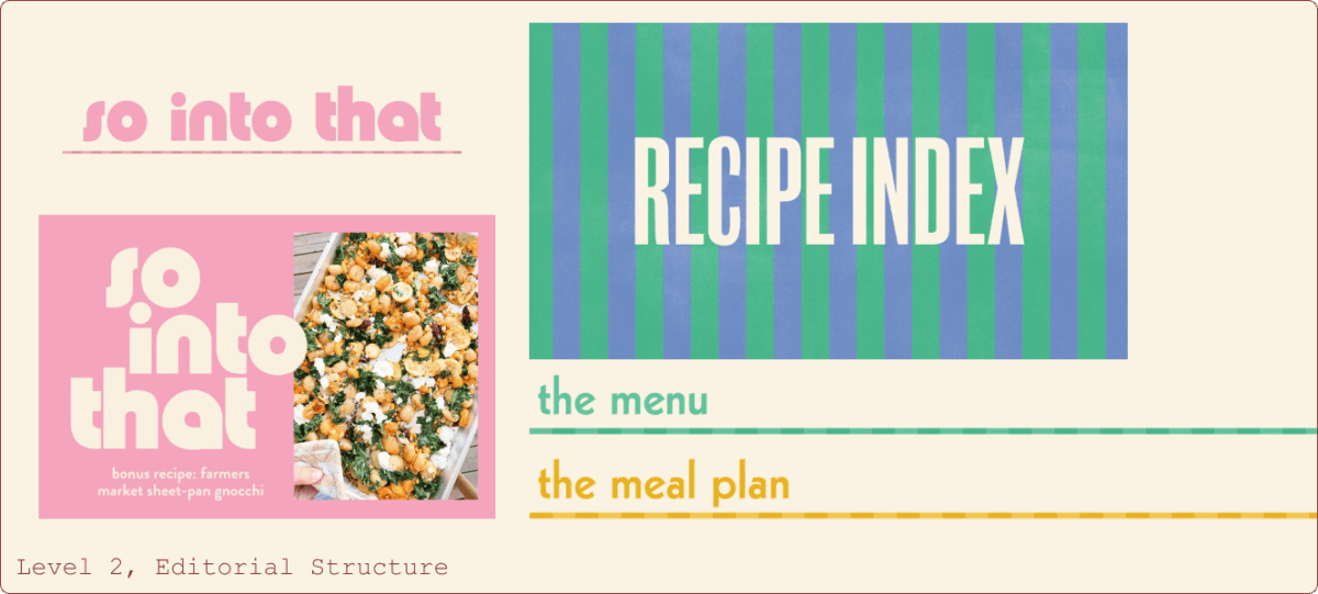
The design couldn’t compete with the food, or with Caroline’s voice. It had to know when to step forward and when to get out of the way: a featured image that tells a reader “this is the recurring series” before they’ve read the headline, a collage that makes a roundup feel editorial instead of like an ad, a recurring heading style that makes a long recipe easier to scan.
For a food publisher, the answer isn’t putting a logo on every photograph. It’s building a system that knows when to lead and when to let the food lead instead.
Good design starts with the publishing cadence.
None of this starts with color palettes! It starts with understanding what actually gets published, and when. What repeats every week. What’s free versus paid. What needs to be recognized immediately versus what needs to be scanned.
A beautiful system that slows down a busy Thursday isn’t a system. It’s a chore.
We prefer to learn the cadence and content architecture first, then build the system around it. A weekly recommendation section might need a custom divider. A monthly paid guide might deserve its own visual treatment. A publication with strong recurring departments needs a clearer hierarchy. We design best when we know what you’re actually going to publish.
Custom doesn’t have to mean dependent.
There’s often a false choice between custom design and something a team can actually use. What’s custom is the concept, the illustration style, the hierarchy, the recurring formats.
What’s editable, titles, photos, dates, recurring labels, gets handed back in Canva, so nobody has to come back to a designer to send this week’s issue. Custom doesn’t mean precious. It should still work at publishing speed.
A simple framework for what to brand, at any stage.
Level 1, Recognition: a wordmark, a square icon, an email header, a color palette, one or two dividers. The goal is to be recognizable wherever you appear.
Level 2, Editorial Structure: featured images for recurring series, custom headings, collage templates, paid post indicators, pull quote styles. The goal is to help readers navigate the content.
Level 3, Publication World: a custom illustration library, recurring characters, seasonal systems, downloads, merch, landing pages, event graphics. The goal is to turn the newsletter into an ownable world.
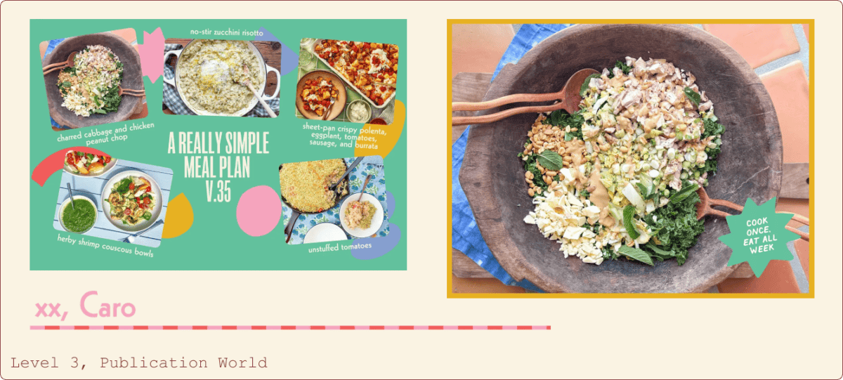
You don’t need every item at once. The system should grow as the publication does.
Recognition is a form of trust.
Over time, a reader learns that a particular color, illustration style, or heading means a new issue has arrived from a publication they value. That’s a small moment of anticipation, and for paid readers it matters even more.
They’re not only paying for information. They’re paying to be part of something made by a specific person, with a specific point of view.
The goal isn’t for a reader to think, “this looks nice.” It’s for them to think, before they’ve even read the sender name, “I know who this is from.“
Where this is heading.
The future of newsletters will have more AI summaries, more automation, more templates, more publications competing for the same six inches of inbox. That makes specificity worth more, not less.
A custom illustration won’t replace a sharp point of view. A beautiful header won’t build a loyal audience on its own. But when the writing is already worth reading, design is what makes it unmistakable, what makes a reader think, before they’ve even opened it, that there’s a person on the other side of the email.
We don’t want to make your newsletter look like a brand campaign. We want to make it look more like you.
Publishing something great but feeling like the design hasn’t caught up yet? Reach out and tell us what you’re working on.